Conversations on bad design, poor decisions, and evolving design sensibilities

Overview
17 December 2021 | 16 min and 43s
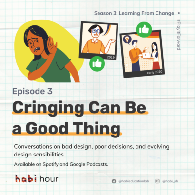
Is cringing something we should be avoiding? Or is there something more profound to it? In Episode 3, LXDs Chess, Jovi, Bernice, Thessa, and Kaye explore how as designers, cringing is a sign of growth.
Transcript
Introductions
Maia (voice over): What makes you cringe? And what might that cringe mean?
Chess: Things that make me cringe… hmm. Isa yung mga public signages na hindi malinaw. Kunwari, left turn, right turn, ’yung directions or instructions sa public places. It makes me cringe kasi instead of adding clarity or giving clarity to the people, it adds confusion. Mas nakakagulo pa siya.
Jovi: Kapag nawala sa timing, so usually kapag mali ’yung pasok sa kanta, o namali ’yung maling dance step, o ’yung di na tama yung hulog sa punchline.
If I cringe from something I saw from other people, then it’s also second-hand embarrassment naman, na tipong I almost always think about what I would feel if I were in the other person’s shoes.
Bernice: Memories of moments when I wasn’t being true to myself where I was likely trying to live up to other people’s expectations of me, or I was giving in to pressure that was external to me.
To a certain extent, there was an awareness at the time that I shouldn’t do these things for those reasons. And so when I play it back, it’s one of those moments where I could hear myself telling myself that, “you see, you knew not to do that and yet you did.”
Maia (voice over): For me, I cringe at how different I sound when I use my actual speaking voice which sounds like this versus my voice over voice. How about you? What makes you cringe?
[light music]
Maia (voice over): Maybe you’ve cringed at an old photo Facebook reminded you of – one that gets you questioning your fashion and hairstyle choices. Maybe you’ve cringed as you replayed the last interaction you’ve had with someone, or the email you sent and couldn’t retract.
Cringing is obviously not the greatest feeling in the world, but if we dig deeper, there’s something so profound about cringing.
I’m Maia, a learning experience designer from Habi. In episode 3, together with our team of LXDs, let’s bask in the awkwardness of it all as we look back to designs and design decisions that make us cringe.
MUSIC: Habi Hour Intro
Maia (voice over): “I thought I did great! I thought it was one of my best works!” but you look back after some time and go, “What in the world was I thinking?!” We cringe because we have expectations (of things, of other people, of ourselves) that are not met. We hold ourselves and the people around us to a certain standard, that when those standards aren’t met, we feel a little embarrassed. But this awkwardness and discomfort isn’t always a bad thing if you dig deeper and consider why something made you cringe.
#1 Uncovering Assumptions About our Learners
Maia (voice over): In our conversation with fellow LXDs, we uncovered 3 main reasons why we designers cringe.
#1, as designers, we cringe when our assumptions about our learners are uncovered.
[light guitar strums]
Chess: Recently meron kaming dinesign na workshop for senior high school students. Tapos during our FGD with them, isa sa mga nabanggit nila na they wanted the workshop or they enjoy is having interactions with their co-learners. So ’yun, we took that into consideration. Tapos gumawa tayo ng mga activities that will really allow them to interact with each other. So may mga breakouts, then may mga collaborative activities so that they can get to interact.
So n’ung actual workshop day na, we noticed that when we had the breakout groups and the spaces for collaboration, the rooms were very quiet. Sobrang tahimik. Halos walang nagsasalita dun sa mga participants. So when we tried asking, “Kumusta? How are you?” They mentioned na they have a different space for conversation, so meron silang chat group either sa messenger, or sa iba pang chat group nila. Tapos dun daw sila nag-uusap. So that was very unique na on the breakout room, tahimik sila, pero it doesn’t mean na they’re not interacting. Because we’re seeing it in the workspace, eh. Nagagawa nila yung outputs for the activity.
Jovi: What I will share is a story from my previous job. We were tasked to do like a 3-day Design Thinking workshop for some NGOs to help them uncover better ways of working together. So we covered the basic frameworks and also hands-on activities. We aligned each of the program components, uh, with what we thought were the objectives of the participants as discussed with the organizers
Unfortunately, things didn’t go as planned. We were met with a lot of resistance from the participants and it was difficult to go through each of the activities if they didn’t engage with the mechanics fully. We found out near the end of the first day that it was because the participants had a completely different set of expectation so of what their gathering was supposed to be about. So they didn’t really expect to go through a workshop and had different pressing concerns that they wanted to address as a group. And as someone who was just starting out to facilitate these kinds of workshops, it was quite stressful to navigate.
Maia (voice over): “Akala ko ganito sila” or “I thought this would work for them”. But then, we are reminded that we are NOT our learners.
Chess: So it was really a different behavior that we noticed na napaisip kami na – huh, baka for us ’yung engagement means nag-uusap, may conversations, may dialogue. But maybe for them, ’yung conversations and dialogue doesn’t have to be oral. Puwedeng written sa chat groups. So ano lang din siya, it’s also a big realization that engagement might look different for different people.
Jovi: The top thing that I learned is that it’s really important to align expectations and communicate these expectations before entering into the learning experience. Otherwise, the misalignment and the tension becomes a barrier to learning.
#2 Realizing Gaps in our Design Processes
Maia (voice over): #2 As designers, we cringe when we realize gaps in our design processes.
[light guitar strums]
Mitzi: So I used to design vector illustrations of people for a content before. That was like 2 years ago. Wala pa dito yung Habi folks na organic yung shapes niya and mas dynamic.
[Chimes]
Maia (voice over): Mitzi is one of our resident visual designers. If you look at the art of this episode and a lot of our social media posts, you will see the “Habi folks” Mitzi illustrated as part of our brand.
Mitzi: And ayun, I designed it using vector illustrations and napansin ko, although at the time, I was kinda proud of myself for designing or for illustrating people using very simple shapes, light, gan’on. And now looking back medyo nag-cringe ako nang slight kasi parang ang stiff tingnan. Hindi siya ganun ka-interactive, or hindi siya ganun ka-dynamic looking.
’Yung Habi folks nagkaroon – parang nasimulan ko siya last year. Mas naging dynamic na siya, mas naging friendly.
So parang ’yung parang, evolution ng Habi folks is from stiffness and medyo ‘meh’ tingnan to fluid, organic, and more friendly, dynamic people, Habi folks nga. I realized na you’ll still continue to evolve especially in your taste in design, in illustrating, and that’s okay. And mas naging flexible din ako when it comes to my work ethic, my work tools, working tools, but still injecting my style, my taste as a designer. So hindi lang siya templated and nand’un pa rin ’yung flavor ng Habi, ’yung flavor ko as a graphic designer, as an artist. I still continue to evolve, and I’m happy where I am now as a designer.
Maia (voice over): Sometimes even our go-to designs, tools and processes invite us to try something new and embrace change.
Bernice: An example of this was when I designed Learning Day for Habi.
[Chimes]
Maia (voice over): Learning Day is one of our whole-team experiences where we block off an afternoon every other month to learn together. Any LXD can host and design a Learning Day session just like Bernice did.
Bernice: I designed it following a specific way that I thought was how I was expected to design it. I followed the structure that typically goes with designing learning experiences.
Bernice: However, it didn’t exactly work to my expectations. It didn’t exactly end the way I thought it would end. Somewhere midway through, it was requested that we take a step back, that we discuss what actually was going on.
[Chimes]
Maia (voice over): For context, during the Learning Day activities, the team asked to pause and negotiated on the LX design since it wasn’t working for some of us.
Bernice: What I learned about my designer self is that things might not go according to my plan as expected, and they will likely not go according to plan if I stick to a rigid way of designing without thinking too much or maybe not giving enough thought. The way to be human in designing and one of the things that we need for well-designed experiences is to actually design according to not a perceived need, but an understood need. That I should have designed, that I should design, for the learners, not to follow an equation of what supposedly good design is.
Maia (voice over): Cringing at decisions our past selves made is a sign that we’ve changed, that we’ve learned, that we are still learning.
#3 Reflecting on our Evolving Design Sensibilities
Maia (voice over): And #3, reflecting on our evolving design sensibilities can also make us cringe.
[light guitar strums]
Thessa: As a designer, I thought na yung strength ko was being able to create informative learning experiences, na ’yung tipong kahit gaano pa karami ang detalye at knowledge na ilalagay d’un sa LX, I can help process those and make those digestible for any learner.
One time though, we worked on a microsite that housed tutorials on using a learning management system. Merong videos, may step-by-step instructions, may images. And as one of the designers, I was thinking, “Okay yan! Marami tayong matuturo using those.” But when I visited that microsite months after, I spotted a lot of things that can still be improved. It was jam-packed, it was rich, but it was also overwhelming for the learner for sure.
Maia (voice over): “This is good, but it can still be better.” Not everyone can say this about something that they designed.
Thessa: In constantly working and improving myself as a designer, I learned about my design sensibilities. Hindi lang basta creating an informative learning experience. What I can do well pala, and what I can actually channel every time that I design is my strengths of making LXs intimate and personal. I practice empathy and always take a step back to think of every possible learner context, and try to address these.
Maia (voice over): It takes a self-aware designer to be able to point out what else can be improved and how else a design can better fit the contexts of learners.
Kaye: One of the first things that I designed, uhm, with Habi, was a digital citizenship and digital literacy module for teachers. Dapat by the end of the module, they could make an infographic or a learning video that promoted positive behavior or positive online behavior to their students. That was in 2017. Kaka-elections lang, so I had very strong feelings about things like fake news, good behavior online, and so I designed it with the feeling of seriousness and gravitas. Like if we can get this right, and we can promote good behavior to our students then we can probably change the world. So I had that perspective when I was designing that module.
Kaye: For that project, I would regularly get the least number of finished projects. Tapos laging maraming nagda-drop-out of the module in the middle. ’Yun pala, masyadong academic ’yung approach, masyadong serious, masyadong intellectual. And I think that I was also asking them to produce too many things. So the project wasn’t really fun for the teachers, and when something isn’t fun, when something isn’t delightful, it’s not motivating. When something isn’t fun, it’s not very motivating or parang nawawala ’yung gana mo to actually finish the project.
Maia (voice over): To be able to describe your own design so honestly like Kaye did—masyadong serious, masyadong intellectual, not really fun—again, not all designers do that. But this honest assessment of your own design is what actually helps you get better at it.
Kaye: What I realized about my designer self is that my designs reflect who I am in real life. I am serious and reflective, so there are a lot of moments where the design or the experience has those moments where it’s serious and we are reflective. But that can be uncomfortable for people. So one thing that I’ve been taking into consideration is, how can I design experiences where people feel supported through the discomfort of reflection? How can I insert more fun and delight into the learning experience so that it doesn’t feel so heavy? It’s a work in progress, I think I’m still trying to find that right balance, and it’s okay.
Synthesis
Maia (voice over): Cringing is obviously not the greatest feeling in the world, but you see how there’s something so profound about it? Cringing means we’ve grown. Cringing means we know better. Cringing means we are learning from change. We cringe because we know what good design looks like, and how much better the design of things around us can be.
MUSIC: Habi Hour Outro
Maia (voice over): And my invitation to you is this: surf the cringe. Go ahead and look back to old designs, lessons, trainings, modules, videos, and other LXs you have made in the past.
What do you think of your own design? What do you stand by? What would you change? See how your current designer self would be a healthy critic of your own work. See how much you have changed. See how much you have learned from change.
Now, look around you. What makes you cringe? What poor decisions, bad design, and everyday things scream, “WE DESERVE BETTER THAN THIS!” Go ahead and cringe, then come design better futures with us.
[Habi Hour ending music fade out]
Maia (voice over): Habi Holidays, everyone! We’ll be back with more Season 3 episodes next year.


