Showing your work to others can be terrifying, moreso for those who are new to Design Thinking. Perfectly normal. Since we’re so used to showing best versions of our work, letting others take a peek at our rough sketches or unfinished ideas brings out a mixture of embarrassment, nervousness, and cringing. But that’s exactly what Design Thinking is trying to change, forcing designers to distance themselves from their work and providing opportunities for users to comment on the prototype early on. Essentially, we’re transforming the participants’ role into co-designers. User testing sessions, prototype showcase, gallery walks, feedback sessions, whatever you call them, are very powerful tools to engage communities and share with them the ownership of a solution. Based on our experiences in prototyping and testing ideas to schools and teachers, we came up with three key tips on making prototypes that participants would love to test and give feedback on. Let’s call them the three I’s:
Invite participation
Make prototypes that participants would love to touch and try out. The success of the prototype testing session is not based on the amount of praise or likes your idea would get, but based on how useful the comments are to the process of making next versions of your prototype. Imagine this: you’re still in school, and your teacher asked you to submit outlines for a long essay. You spend hours and hours trying to get the wordings right, the structure logical, the message clear. You’re very proud of your hard work. On the other hand, your classmate wrote a rough draft for an outline, but included questions in parenthesis for the sections he needed extra help on. Which outline would receive a higher mark? Which one would receive feedback that would be useful for improving the next version? While your outline might receive a higher mark, your classmate’s rough-but-question-laden outline might gather more insights from the teacher. Think of prototypes as interactive questions that you (designers and researchers) are trying to answer through feedback from the participants. Focus on that, instead of the fidelity or polished quality of the prototype. Validation would be nice, but formative feedback would be better. (note: a very good framework for making prototypes is a 1997
article by Apple Engineers Houde and Hill, “What do Prototypes Prototype?”)

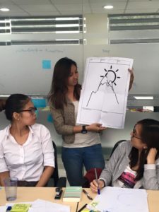
Showing an assembled sheet to a group of participants
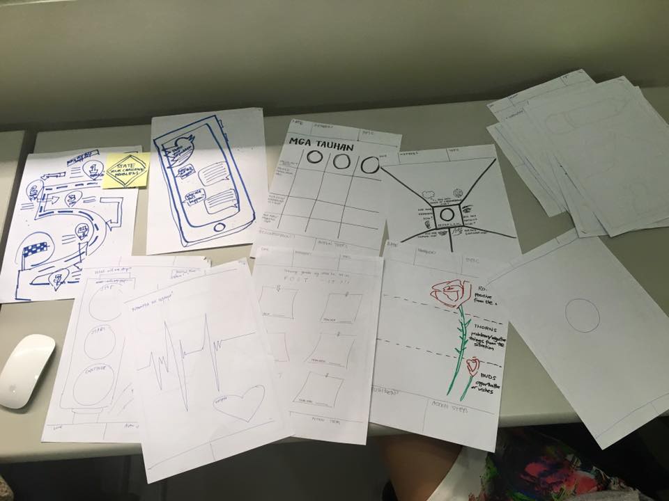
In a project that involved developing worksheet kits for teachers, we created prototypes that were large (4 sheets in size, glued together) and varied (we made different versions of graphic organizers). We didn’t focus much on the quality of the sketches or consistency of fonts. We were more curious about how the participants would use the sheets; specifically if they were (1) easy and fun to use, (2) helpful in structuring their discussions, and (3) promoting collaboration. These prototypes were done in 4 hours, from initial sketching to digital layouts. The size played a key role in inviting participation (large sheets for team work), as well as the way we wrote the introductions and prompts on the sheets (conversational Filipino and English mixed with engaging guide questions). In the end, we saw participants actively using, picking, debating, and drawing on the sheets. We observed diverse behaviors: some teams distributed the sheets to members, some read the questions first, some jumped into assembling the 4 sheets into larger ones. What if we just printed small versions of the sheets, showed them to participants, and had a focus group discussion? Would we have gotten the same amount of rich feedback about the product? Probably not.

4-hours of prototyping 15 types of sheets, rough and ready!
Improvise the hypotheticals
Sometimes, prototypes are not enticing enough for participants to try out. They need context and guidance in order to start tinkering with it. If you’re making a poster about school services and you show a sample poster to a group of students and then ask them what they think about it, the comments might not be too revealing. To get better comments, instead of simply showing it to them, add a story in the beginning: “Recall how you felt like in your first year here, and try to play that role of a freshman student. While walking in between classes during your first week, you see this poster about school services. How would you react? What do you think?” Especially for rough prototypes, it’s difficult for participants to see how they would look and feel like in real situations. That’s where role playing and improv theater exercises help. Add a back story. Give them characters (based on user personas) to try out. Provide goals with corresponding challenges. Develop hypothetical situations where the prototype would be used. This way you can, in real time, see how your prototype would play out in situations, in effect gathering more authentic and meaningful feedback. Don’t worry about stepping back and going “meta” about the prototype, you can facilitate discussions about the prototypes after. In fact, having them role play on hypothetical situations will make the discussion richer, since you’re taking into account multiple perspectives and actual experiences.

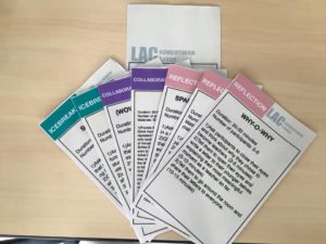
Prototype cards. We tested these on participants through role playing and improvisation.
When we were prototyping flash cards for teachers to use in meetings, we relied heavily on role playing and improvisation. The cards contained ice breakers and discussion questions, and was designed for facilitators to easily pick from the pile and immediately implement the activity as indicated in the card. In one specific testing session, the participant playing the role of the facilitator got awkwardly stuck. He had a hard time starting a role-play discussion, became very uncomfortable, and was trying to get out of the session. The co-participants noticed, and provided support and played along as if they were real participants trying to help their facilitator figure out the cards. “Sir, I think we can start the session. I think we can pick one card and you can try facilitating the activity?” When those didn’t work, we quickly had to think of hypothetical situations (“So we’re in a meeting about using technology in the classroom, and we all tried using Powerpoint and Prezi to compare both. Think of previous experiences with those apps. We’re coming into this meeting now with those back stories.”). We needed to come up with stories that users can relate in and guide them in placing themselves in situations that would let them “play” with the prototype. Successfully bringing those out during testing sessions would not only make it more fun, but the feedback more authentic.
That’s where role playing and improv theater exercises help. Add a back story. Give them characters (based on user personas) to try out. Provide goals with corresponding challenges. Develop hypothetical situations where the prototype would be used.
Intentionally design the experience
Back to the concept of prototypes as questions. If we treat them as questions (or experiments) then they have to be specific. We’re prototyping for a reason, whether to clarify assumptions, to validate design choices, or to explore possible improvements. In preparing for the testing, the way we present the prototype and gather feedback has to be aligned to those questions. It’s not a simple show and tell session, but a carefully and intentionally crafted experience. If you have expected behaviors (hypotheses, in research speak), then focus on those. If you are investigating how users would react to the prototype, design the testing session to capture that. This dispels the fear that opening up the design process to users would ruin the project–too much cooks spoil the broth, they say. It’s a balance between engineering the testing session while at the same time being prepared to go “off-script” and taking in all comments and observations from the participants. In the end, it’s up to the designers to distill the information to produce clear and actionable improvements for the project.

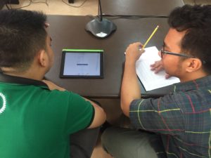
A participant testing the website in a mobile device while the researcher captures data and asks questions
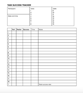
We had a website project, we designed a platform for teachers to share and remix materials. The features were mostly new, so we decided to get early feedback from real teachers about the core functionalities of the website. To prepare for the user testing sessions, we identified key tasks that (1) were essential to the website, and (2) might be too foreign or difficult for users. Sample tasks: Log in with Facebook, Search for a Biology video, Add a teacher’s tip. The testing focused on these 18 tasks; we asked participants to perform each one as we observed their behaviors. We took note if they succeeded, failed, or had a difficult time accomplishing the task. Questions about color scheme, brand, content, tone, and overall design were contextualized in those tasks: “how did these elements contribute to you understanding and accomplishing the task?” The highly focused session proved very helpful when we came back and looked for ways to improve the website.

Sample form for user testing. The Task Success Tracker checks whether a user has accomplished a task or not.
Yes testing prototypes is difficult, and it takes time to integrate these practices into your organization’s processes. We’ve had our share of failed attempts at testing and prototyping, and have learned that there is no best way to do it but to try. Start small, gather participants for a 30-minute session and jump right in. Use what you know and understand about the users you are working with, be sincerely curious, and acknowledge that in this process of design, they are also experts.
Use what you know and understand about the users you are working with, be sincerely curious, and acknowledge that in this process of design, they are also experts.
